CLIENT
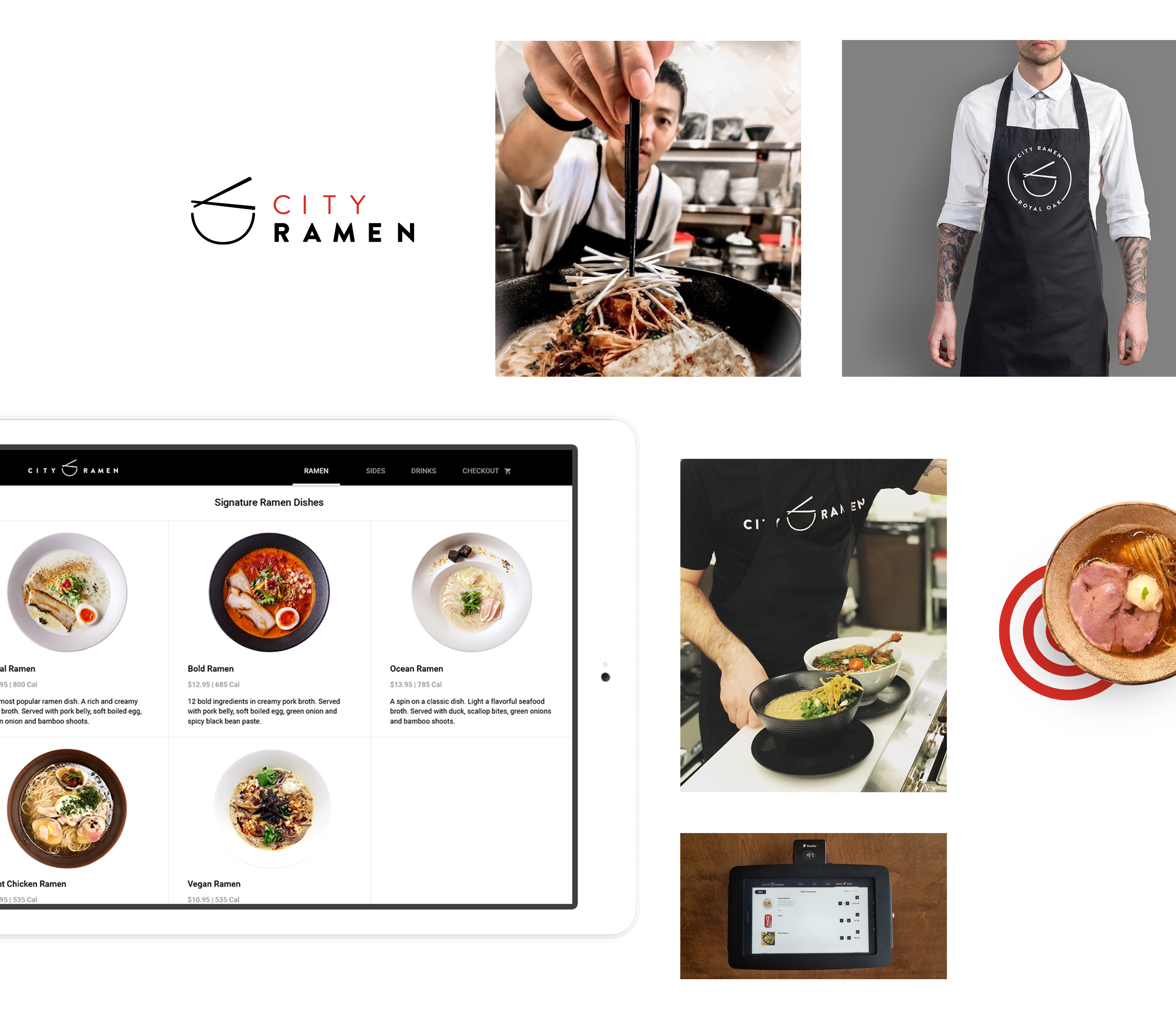
City Ramen
Role
Art Direction
UI/UX Design
Branding
Summary
I created the branding & identity for City Ramen and designed their in-house ordering app.
Problem Statement
City Ramen wanted a truly authentic ramen experience that connected everyday people to real ramen. Their first store opened in Michigan, giving everyone the opportunity to enjoy traditional Japanese-American cuisine. They needed a brand identity along with an application where user's can order and pay in person, all from a tablet.
Project Goals
Become an established brand that differentiates itself from competitors
Connect people to an authentic Americanized version of ramen
Create loyalty by having consistently amazing customer experience
Use technology to elevate the way customers experience ramen
Typographic Explorations
Defining the brand
City Ramen’s goal was to create authentic Japanese-American style ramen. They needed a look that was simple, clean, industrial and a design that would work across multiple mediums. City Ramen can be any city, in any state and will be a fan favorite ramen shop that you can pop into, to curb all your noodle cravings.
After multiple rounds of design iterations, we focused on logo marks that use the font face, Brandon Grotesque. The geometric sans-serif has simplified shapes that showcase clean and modern design.
Brandon grotesque at work
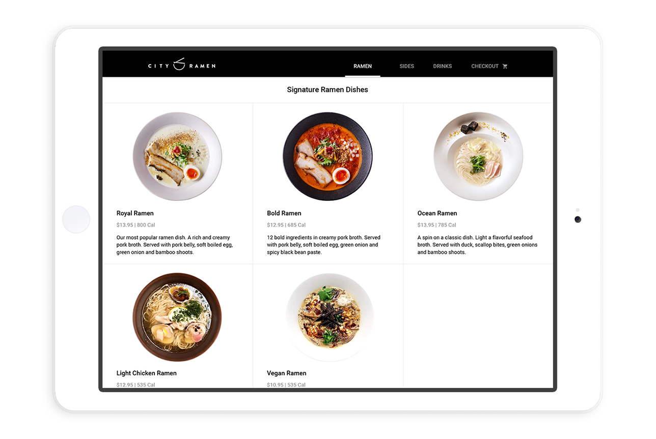
Simple Menu
Customers can select and order from a simplified menu when they walk into City Ramen. Following clean and modern design standards the menu was created to help customers easily make decisions, without overwhelming them with too many choices. Each menu option provides ingredients, total calories and gives the user an opportunity to customize their bowl.
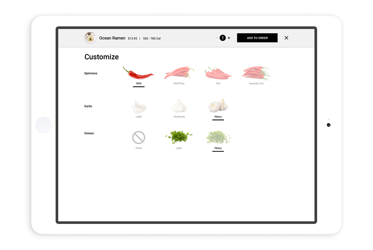
Customizable Options
Designing a screen to help a user understand they are customizing a food selection, was not easy. I took this design and conducted in-house guerilla testing, along with A/B test variations to validate the design. After several iterations from user feedback we landed on a solid design, that is intuitive and works for the user.
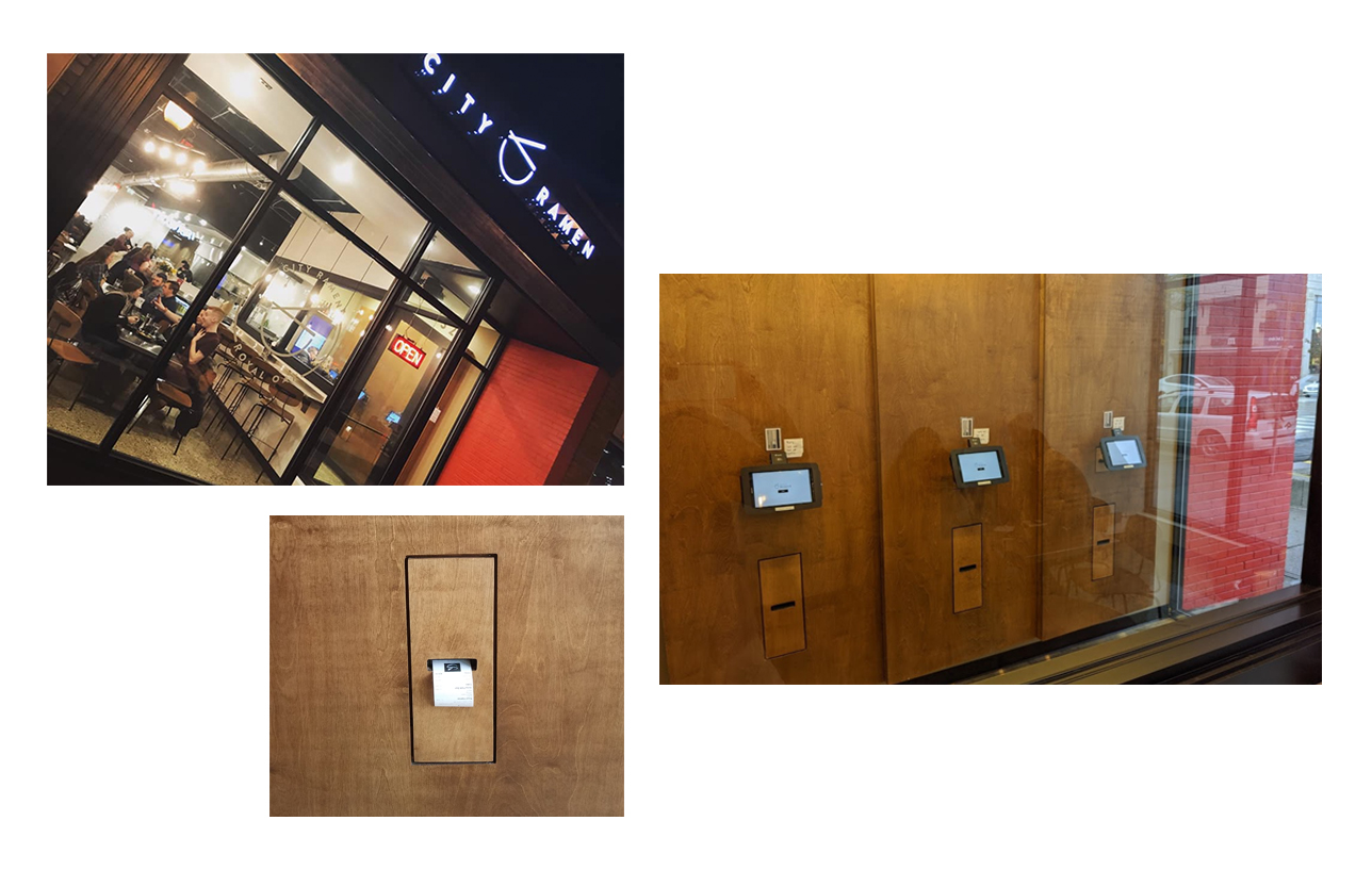
Eat More Ramen
Developing a solution that customers could easily use was rewarding. The design not only allows customers to order, customize and pay, the app sends the order to the kitchen and generates a payment receipt for the customer to keep as proof of purchase. They are seated at a location of their choice and they can enjoy and eat more ramen.
Learnings & Insights
Design & Build for your user.
In start-ups and new companies, there are a lot of great ideas that go into every brainstorming session. It’s a given that understanding client and user goals early on will make designs more successful. But in the process of creating new and exciting designs, it’s easy to lose focus of your end user and why you are creating for them.
It’s so important to keep checking back in by asking foundational questions like “why” are we designing this thing or “how” does this provide value to the user? Finding the right balance between focusing on what’s important to the user and pushing the boundaries of design will ultimately provide the highest value for users.
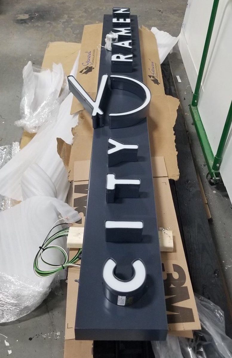
The battle of mediums.
What works for one medium might not work for another. The City Ramen logo by itself is rather long and in theory it’s geometric structure, would’ve lent itself to making great signage. Think back to the 1920’s & 30’s where iconic storefront signs were a bold grotesque, painted font.
However, when it came to producing the illuminated signage that sits outside City Ramen’s storefront, I had to modify several aspects of their logo to make this signage successful. The challenge was that the storefront had limited physical space to work with. This meant I needed to make changes to the length of the logo without distorting the overall look, since it currently lived on other mediums.
The key takeaway for me in this particular phase of the project is that no two mediums and environments are the same. Having the opportunity to design in a 3-dimensional space is different and poses it’s unique set of challenges.